
On Color Constancy
A mechanism I'm obsessed with.

Welcome to an UnRecipe post for all subscribers, all about the color constancy mechanism. Next Tuesday paid subscribers will receive a recipe for chocolate mousse. As always, check out my past posts here and learn more about my day job here. Thanks for reading!
Pst: today is the last day to snag early bird pricing for a spot at Dappled, Emily’s and my retreat this summer! There are just two single rooms remaining. We’d love to have you!
When we moved into our condo, we inherited (among other things) five neatly labeled buckets of paint. I looked around at the monochromatic paint job and then back at the buckets. Why were there five individually labeled buckets of paint for a space painted all one color? Some things, I decided, were best left a mystery. A few weeks later, I was complaining to my mother—did you know how hard it is to throw away paint?—when she told me that several of her friends had done the same thing after a color consultant recommended it.
These color consultants, she said, came in and helped homeowners figure out the exact shade of each base color that was appropriate for each room based on the direction it faced, the amount of light in the room, and the light reflective value (LRV) of the paint color they had selected. By painting each room the precise shade prescribed, her friends (and my unit’s previous owners) achieved the same color throughout every room of the house. I was dumbstruck and, if I’m honest, a little dubious. But a few months later, as we swabbed Chantilly Lace over every room, I noticed that the colors we were covering up all had a slightly different hue.
Humans have a wild relationship to color. Some colors draw us in, and others repel us as though we’ve been slapped. Green signals go, live, breathe. Red signals danger, seduction, speed. We are hypnotized by color, obsessed with recreating it. Our brains have developed shorter circuits to help us understand these waves of light and how they bounce off of our eyes. One of these mechanisms is called color constancy.
This mechanism, which I just read about in Bianca Bosker’s fabulous Get the Picture, is the way our brains adapt to see color consistently in a variety of spaces, regardless of the illumination. The example that Ms. Bosker gave was a crisp white T-shirt: on a summer day in the sun, shaded by clouds and a store overhang, and under the brutal florescent lights of the grocery store, that shirt is white to us. But, really, what we see and what our brain spits out as an observation are two different realities. The white shirt takes on a yellow glow under the sun. In the shade, blues and grays bleed over the white cotton like a bruise. In the vivid commercial lights, we might see stark purple. Our brains have learned to process this information, discard it as a trick of the light, and tell us again, insistently, that the shirt is and always has been white.
One of the perks of being a digital photographer in the year of our lord 2025 is that I have always worked an age where computers can help me do my job. My camera has an auto-white balance feature. All I need to do is put my color card into the scene, and I know I can faithfully represent the right balance of colors. It’s just a matter of clicking the eyedropper and selecting the square of true white.
That same eyedropper has helped to blow a fuse in my brain’s color constancy shortcut, too. See, when I use the eyedropper in the color editor function, I can tell you exactly what shade my camera and computer think something is. By making edits to that single hue, I can manipulate the food to look more like itself or more like an alien experiment to replicate human life gone wrong.
Can I tell you something? Avocados aren’t green. They’re yellow. Except for the pits. Those are red or orange. Chocolate isn’t brown—it’s red and orange and yellow and sometimes even a little bit green. Blueberries? Not so blue. Probably purple, or even red, depending on the season. Blackberries? Oh god, they’re anything but black. A rare pink, a true red, a purple that can only be tweaked by messing with the shadowy blues. Coffee? Deep, pure red, unless you add cream, which doesn’t turn it pink, like you learned in elementary school art class. Here, in my world red + white = yellow.
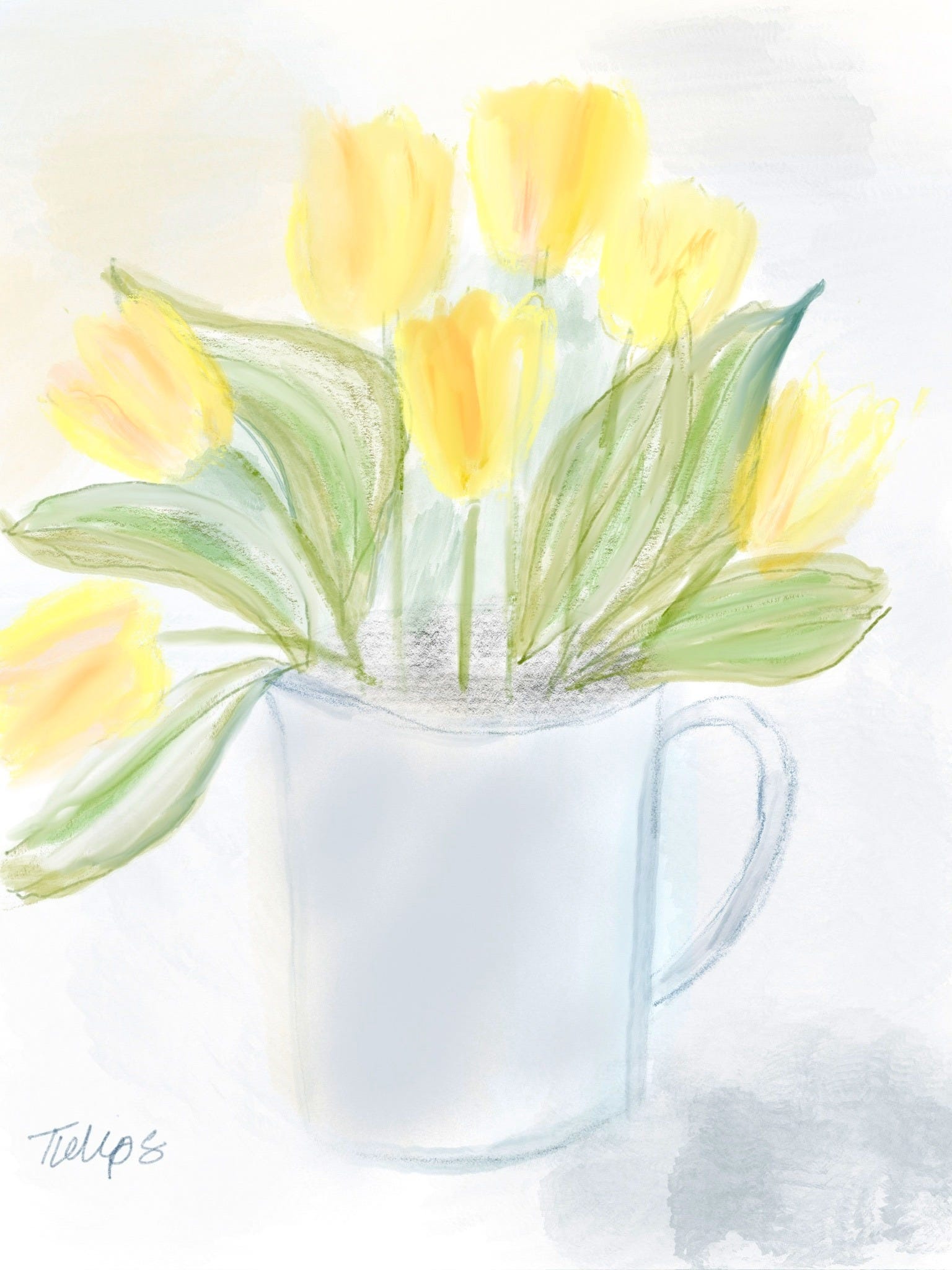
When I look at the white vase in front of me, stuffed full of yellow tulips with green leaves, there’s a simple color palette. Green. Yellow. White. But when you look closer, really look, even with your bare eyeballs, and turn off your lazy, too-smart brain, you’ll see what I mean: the one leaf that caught the edge of the plastic wrapping has bruised dark blue and brown on the end. The rest of the leaves, by the way, are probably more yellow than they are green. It’s just that the contrast of the bright yellow flowers makes them look cooler in comparison. And those yellow flowers! They’re so pure and bright and buttery that they can’t be anything besides yellow. Except there, where two petals overlap and glow sunset orange. And there, in the center of that petal, where it looks like a painter reached her brush in and tickled the flower with her light green oil paint.
Color is all around us. Even in a white room, your blue shirt will bounce up against the wall and make something beautiful. (That’s why I wear black when I’m on set—there’s nothing more annoying than color correcting 500 photos because I wanted to wear my red jumpsuit.)
The photo below will look fairly mono-tonal to you when you see it. There’s orange, and browns that read as orange, and some yellow. But the magic of the photo—why it works, if I say so myself—is the glass. That tiny little glass, which I bought at Goodwill for no good reason, is blue. It’s so blue, in fact, that in this photo full of warm colors, it stands its ground as the only shade of coolness in the entire photo.
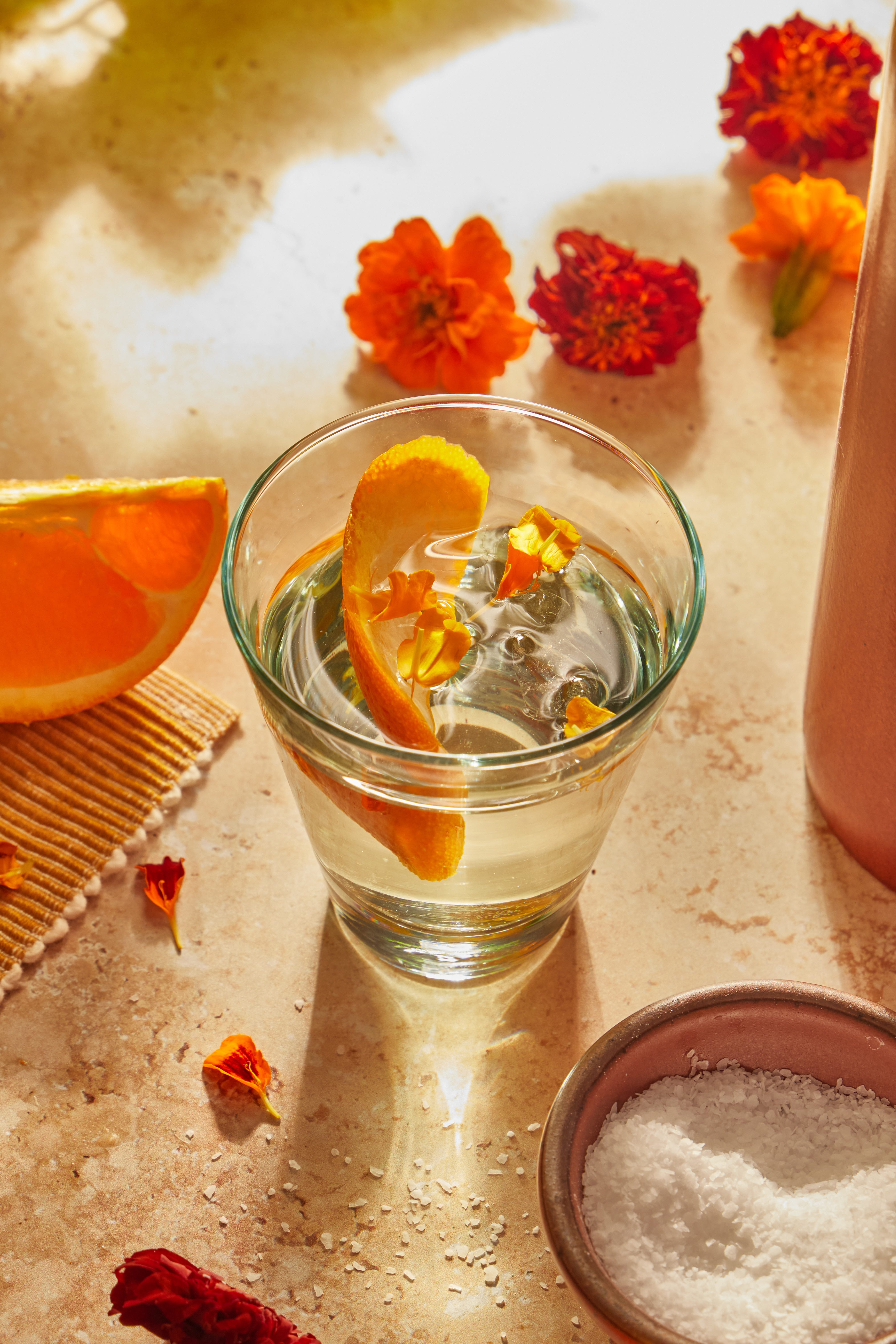
Isn’t that cool? Maybe I’m just a color nerd, but the way that blue glass makes you appreciate the oranges and yellows feels like some kind of color code cracked wide open. The simple act of noticing that the glass even has a color rather than just being “clear” feels like a revolution.
So today, look around you. Notice the hidden colors in the things your eyes glance over. Stop your smarty pants brain from making assumptions and really look—at the citrus piled high in the grocery store, the shades of blue and gray in the clouds, the coffee in your tan earthenware mug versus the latte in the stark white to-go cup. Report back. Let me know what colors you find along the way.
See you back here next Tuesday for chocolate mousse! Yes, even in this economy.
Fellow color nerd really really enjoyed reading this!